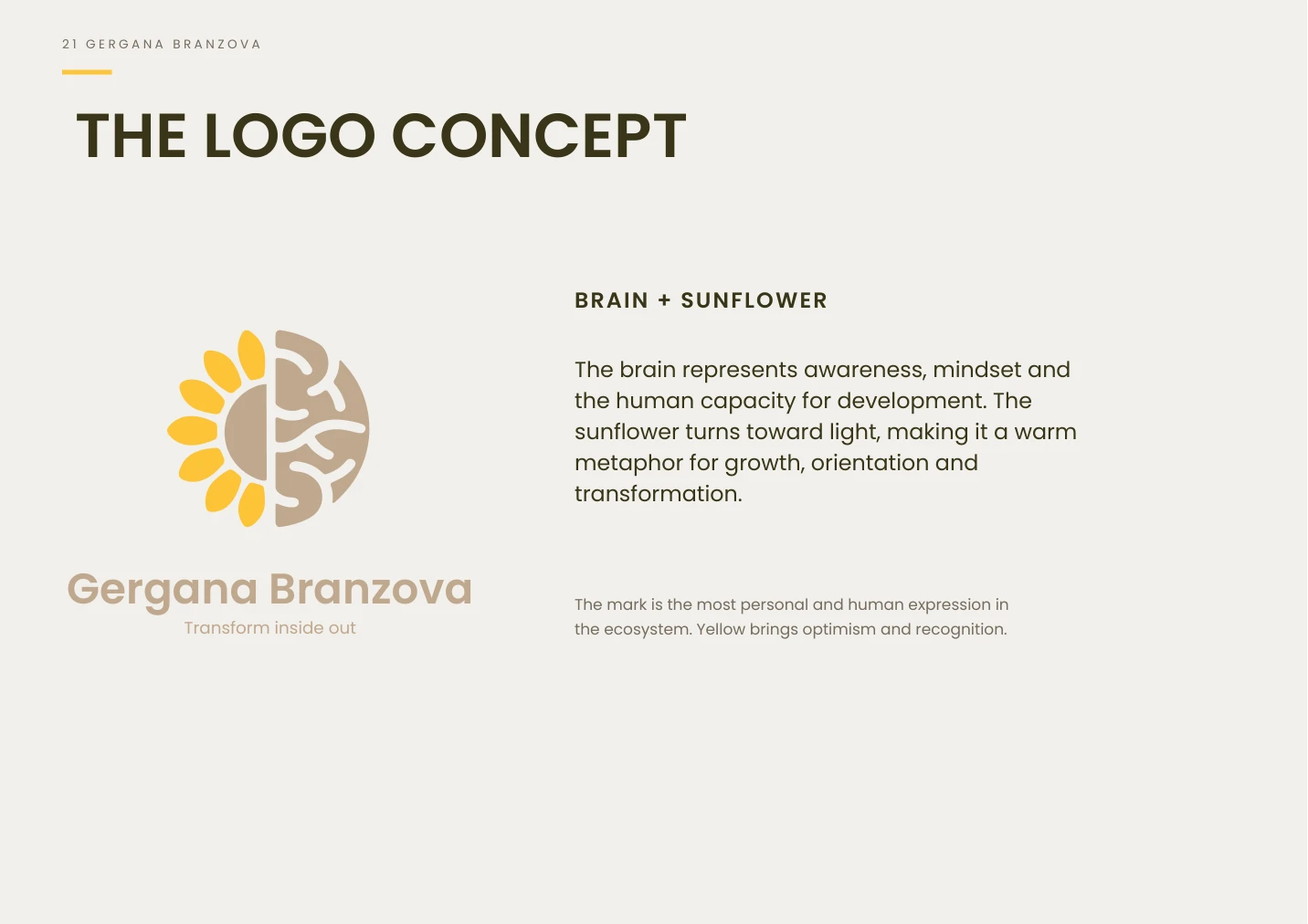
Gergana / Brain + sunflower
Awareness and mindset meet a symbol of growth and orientation toward light. Yellow gives the source brand its own warm accent.
A connected identity system for Gergana Branzova, MindBodyOne and Get Better—three distinct expressions of development from the inside out.
Identity documented in the 2026 brand book. Website rollout in progress.
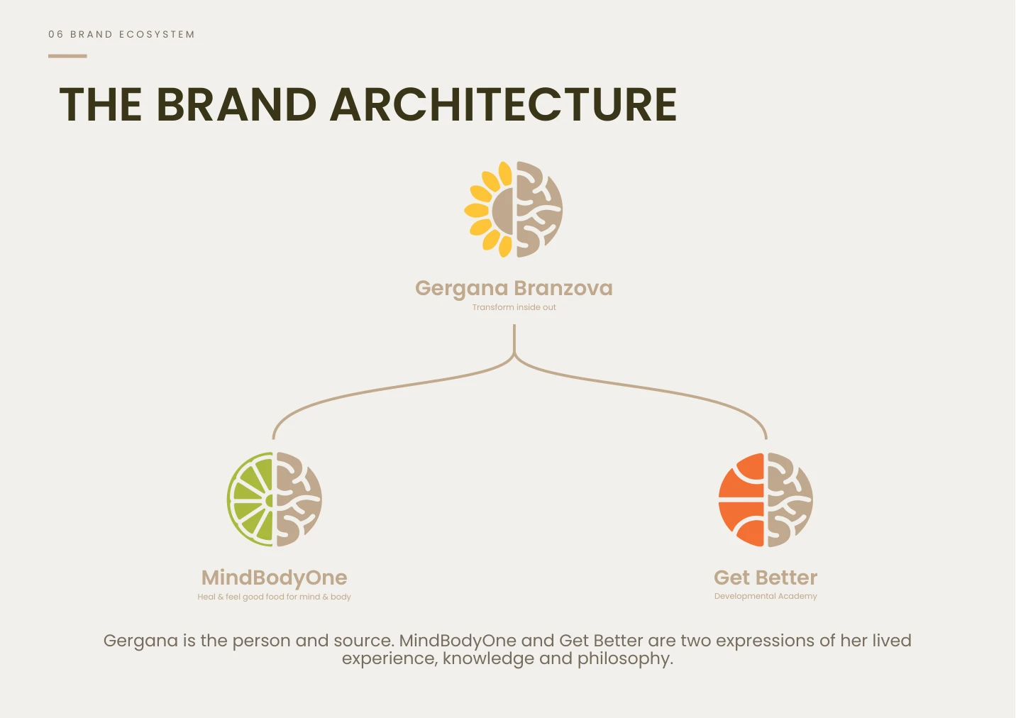
The central design question was how to connect a personal brand, a wellbeing brand and a developmental academy without making them interchangeable.
The brand book establishes Gergana as the person and source. MindBodyOne expresses the inner path through wellbeing and connection; Get Better expresses the active path through sport and human development.
The shared belief—“Meaningful development begins within”—provides the strategic foundation for all three.
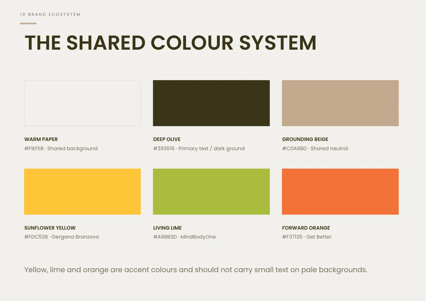
Warm paper, deep olive and grounding beige establish a common base. Sunflower yellow identifies Gergana, living lime identifies MindBodyOne, and forward orange identifies Get Better.
Poppins supplies the shared typographic foundation. The guidelines distinguish its expression: personal and editorial for Gergana, spacious and light for MindBodyOne, and bold and directional for Get Better.
Awareness and mindset meet a symbol of growth and orientation toward light. Yellow gives the source brand its own warm accent.
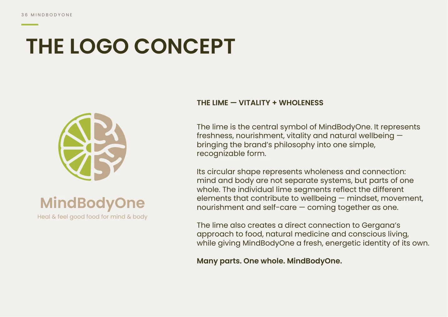
The lime introduces freshness and nourishment, while its segments express many elements coming together as one whole.
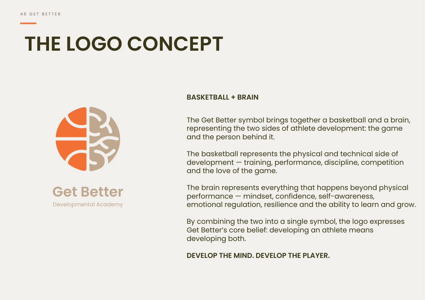
Physical and technical development meet mindset, confidence and self-awareness: the player and the person belong together.
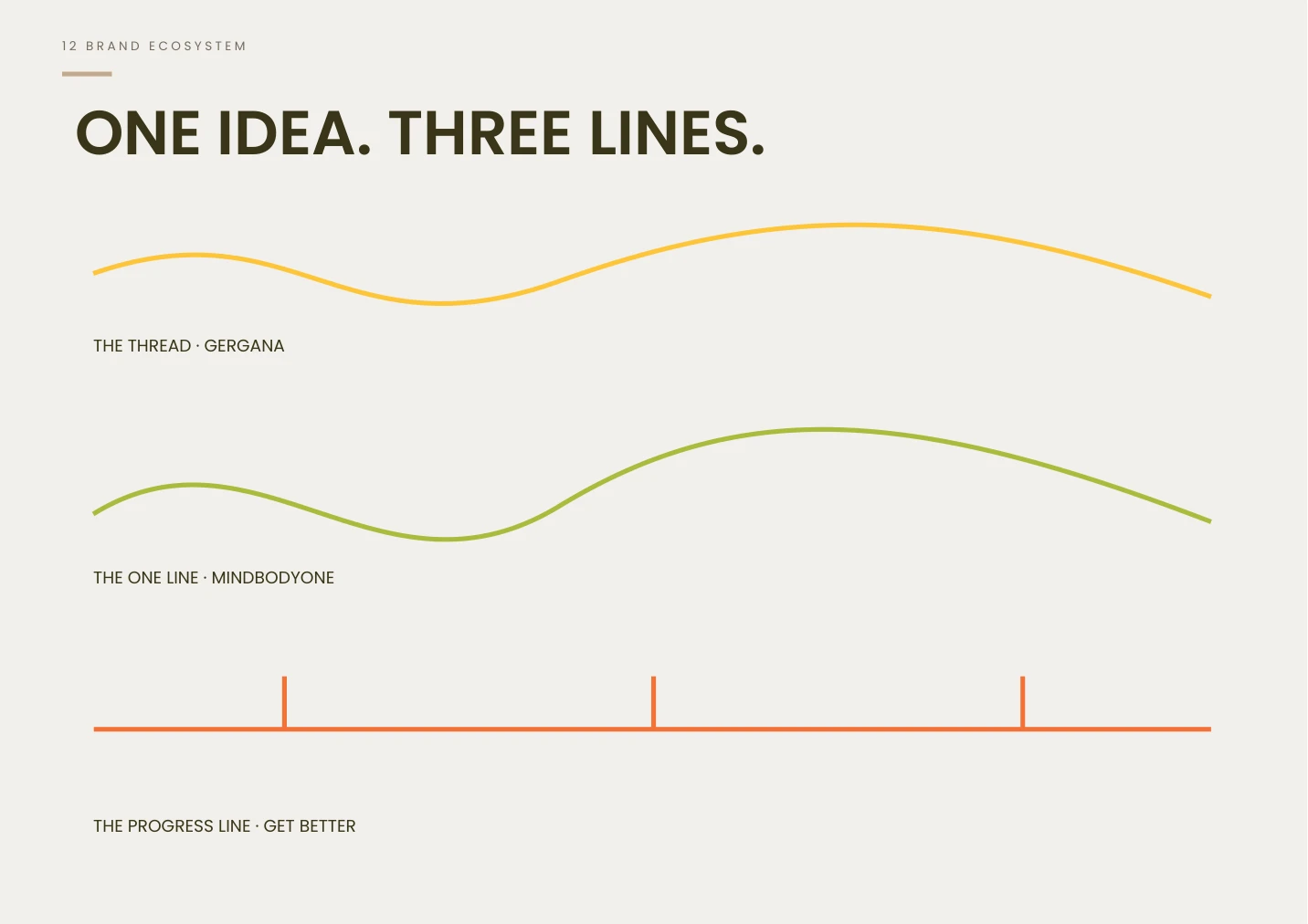
The Thread makes time visible in Gergana’s story. MindBodyOne’s organic One Line expresses connection. Get Better’s geometric Progress Line draws on court markings to communicate direction.
These are documented design principles, extending the identity beyond a logo into layouts, transitions and digital behavior. Gergana’s expression is personal and reflective; MindBodyOne is calm and spacious; Get Better is immediate and purposeful.
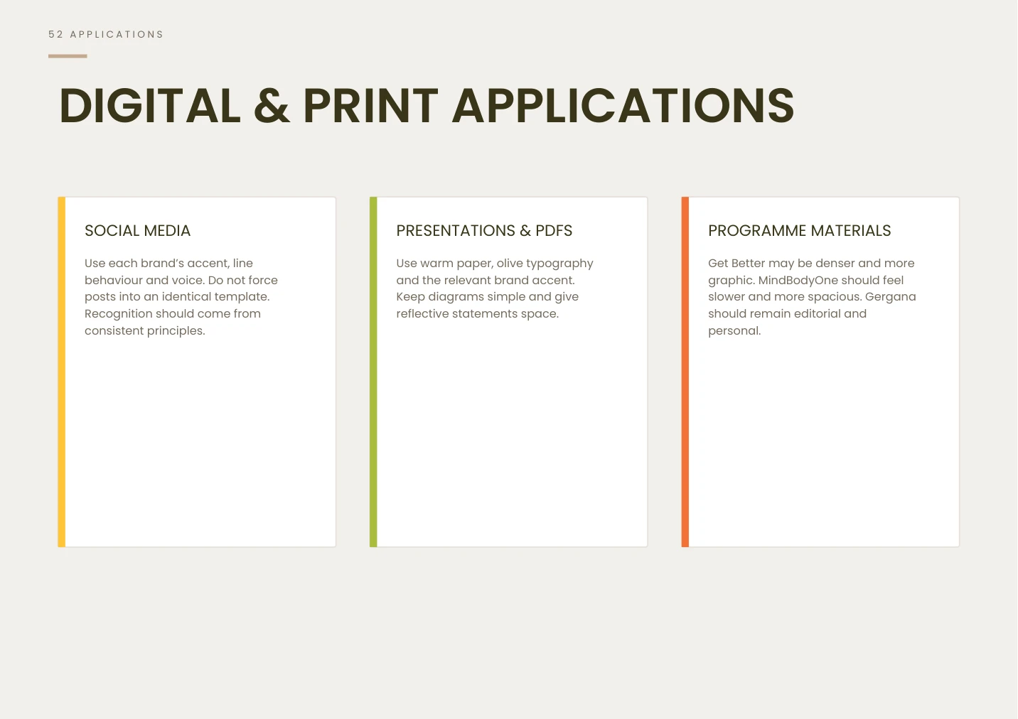
The brand book defines how the system carries into social content, presentations, PDFs and programme materials. Each brand keeps its own accent, line behavior and voice rather than being forced into one identical template.
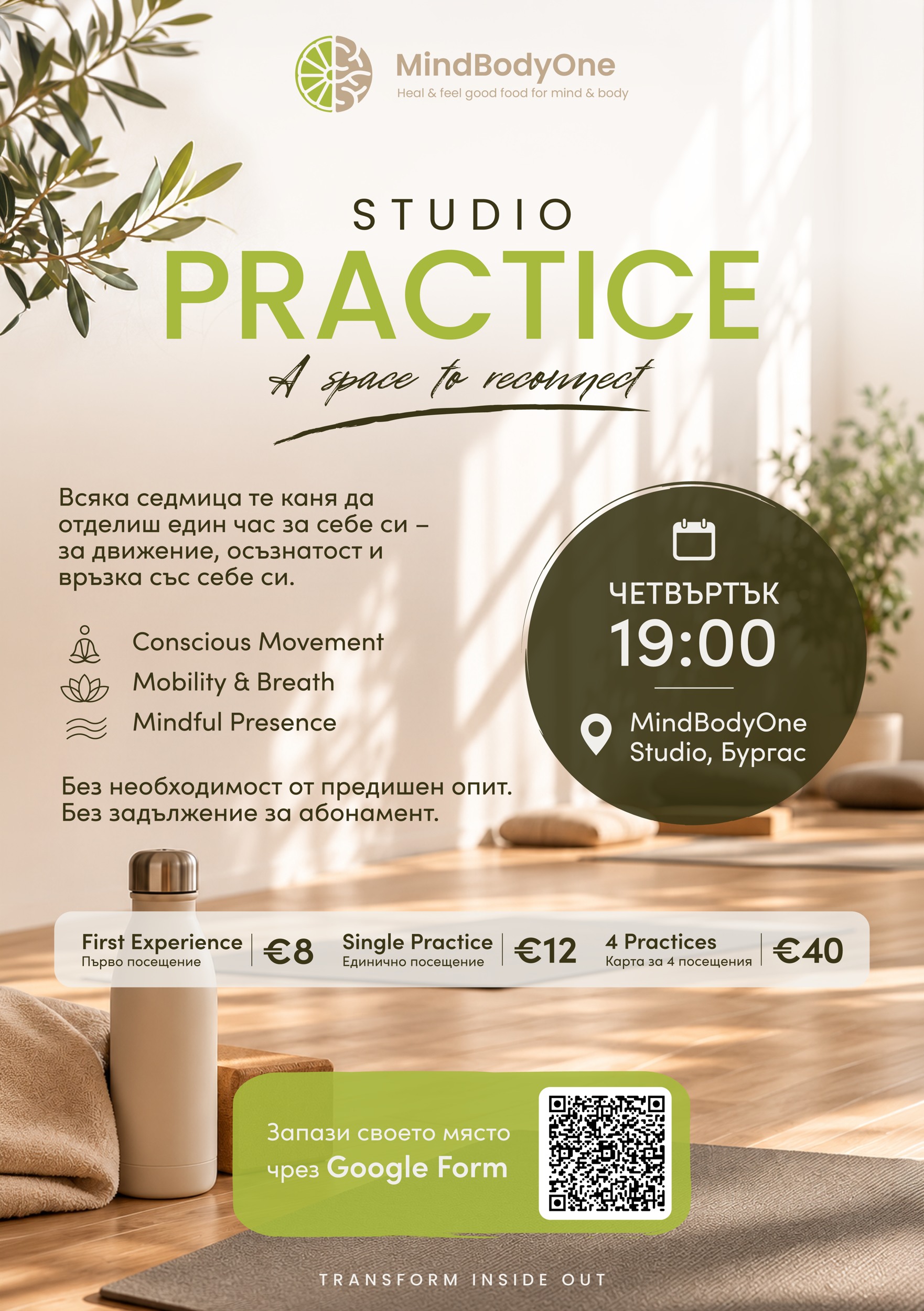
A studio-practice flyer for MindBodyOne and two Get Better partnership flyers for a Bulgarian basketball club bring the brands into practical promotional material.
MindBodyOne’s warm interior imagery and lime accents support a welcoming studio message. The Get Better flyers use blue-and-yellow partnership graphics, basketball imagery and clear information blocks to introduce the programme and explain the training schedule.
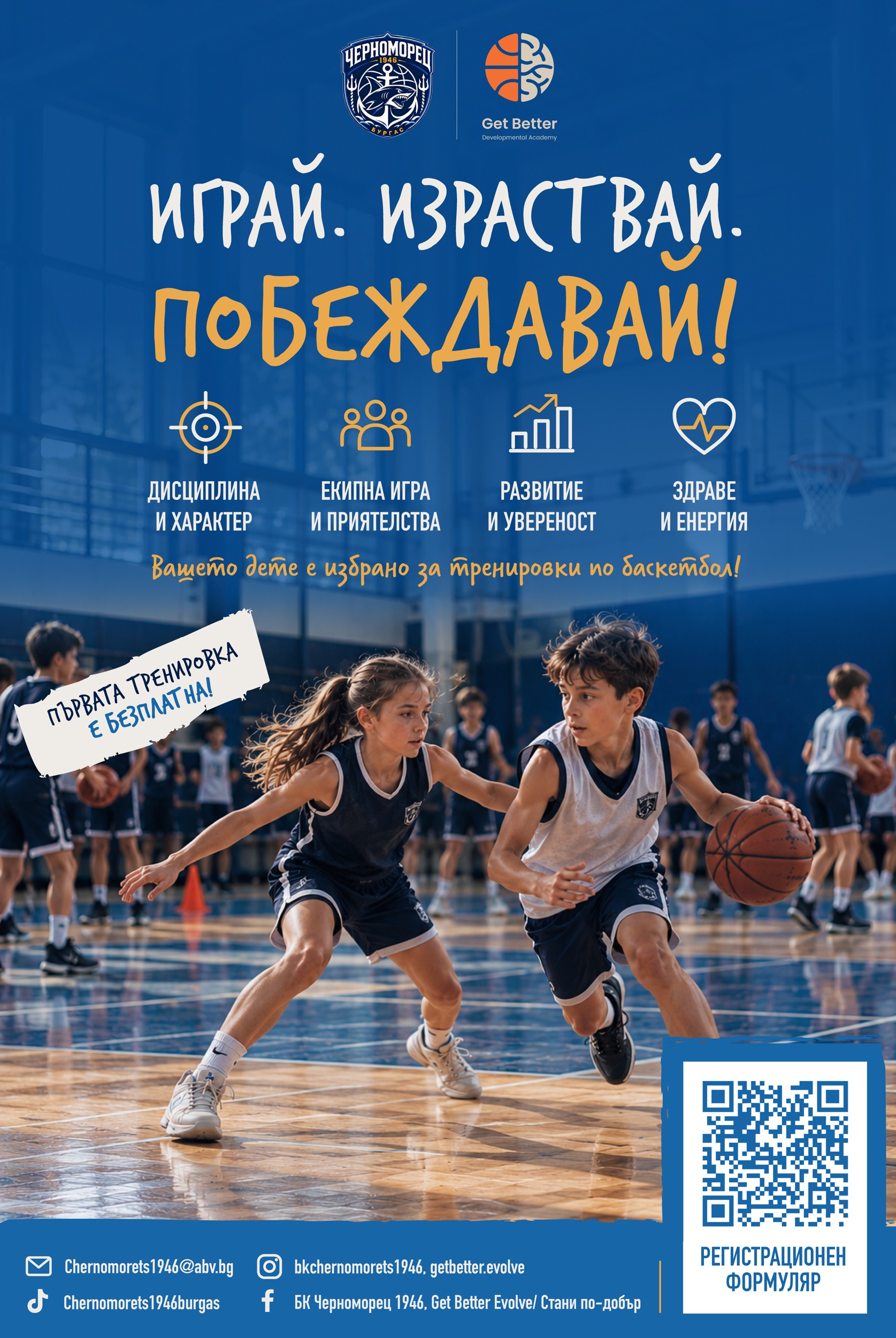
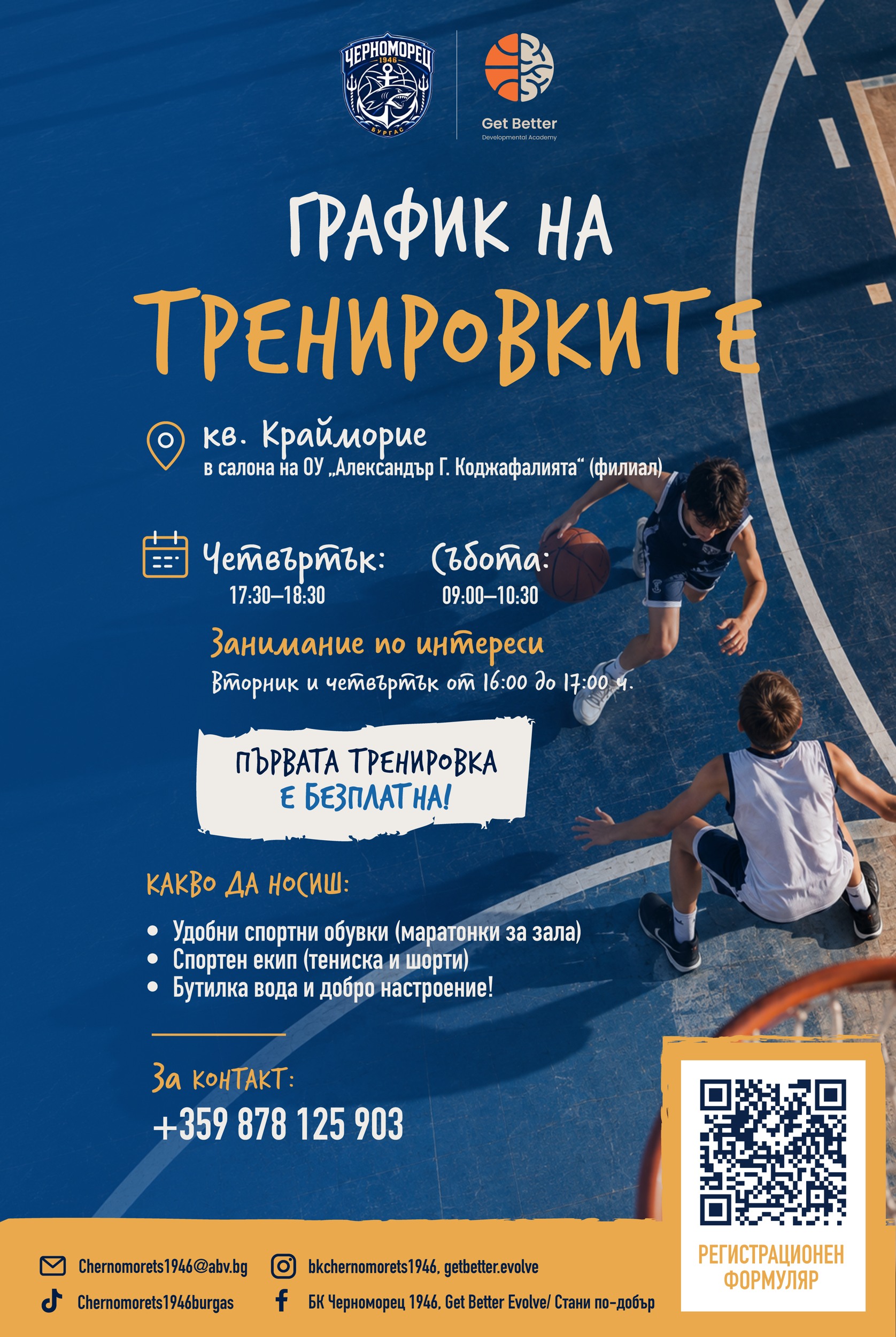
The documented result is a brand architecture and guidelines spanning strategy, messaging, logo systems, color, typography, imagery and applications. The identities share a foundation while retaining different audiences, symbols and modes of expression.
With the website rollout ongoing, this case study focuses on the design system and its intended applications rather than claiming post-launch commercial results.
Let’s build your brand’s next chapter